Judie: For those of you who missed it, in our last article, Dan and I talked about the circumstances behind how we — two iPhone 4S users — each came into possession of an HTC Titan [you can click here to read it]. We also gave some of our initial thoughts about the operating system and why we might have been hesitant to make the change. In this installment, we dig in further into what we like and don’t like about the Titan specifically when it’s compared to the iPhone. Because our Windows Phone experience is occurring on the Titan, the hardware is directly influencing how we perceive everything …
The Titan’s Hardware
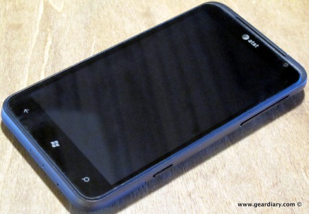
Dan: The Titan takes the best of what HTC has to offer and merges it with a superb operating system. The Titan is solid and heavy enough to feel substantial without feeling too heavy. The volume controls and camera button are on the right. Personally, as a southpaw, I prefer to have them on the left but… that’s life.
Judie: You’ll get no argument from me that the HTC build quality is fantastic, and I do like the bit of extra weight that the metal parts of the Titan’s body provide. My only beef with the Titan’s appearance is that there is nothing other than lower-screen button placement to really differentiate it from any other of HTC’s large-screen devices. It’s not that I think the Titan is necessarily missing some particular design attribute, it’s just that its appearance is a wee bit utilitarian and generic. I recognize that this probably won’t be an issue for the majority of people who use one, but purely for looks — I think the new Nokia Lumia 900 may have an edge (even if it would mean going to a slightly smaller 4.3″ screen). I’ll say more on this if I can ever get the Titan and Lumia 900 side by side.
But with regard to button placement: my main gripe s has to do with how often I accidentally press the dedicated camera button on the lower right side; it seems like it happens all of the time. Since I just about always have my phone in my right hand when I am doing anything other than sitting, I have managed to take quite a few unintentional photos … granted, a few of them were not bad at all. More on that when we talk about the camera. =P
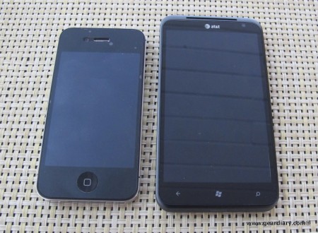
Dan: The biggest deal is, of course, the screen. At 4.7″, it is big, gorgeous, and it has won both of us over in a huge way. I always thought that a 4.7″ screen would be too large, but I was wrong. On it text looks crisp and clean, and the screen offers a huge amount of information at once without the need to fumble and scroll. Sad but true, after using it for over two weeks it is difficult to think about going back to a 3.5″ screen.
Judie: Oh for sure! The first full day into our experiment neither of us could shut up about how wonderful the larger screen was, and yes — we both know that screen size is something Android users have been crowing about for some time. Perhaps size matters more to me now because I am finally using an OS (other than iOS) that I would want to see on a larger screen.
Dan: For years I was a huge fan of Windows Mobile. My first smartphone was the Motorola MPX220. I loved it. From there I went to an iMate Jam, a Jam 2, and a slew of other devices. Thanks to the operating system I was never at a loss for opportunities to tinker. [That statement was not intended as a compliment.] When the iPhone was announced, I thought it was a joke. No apps. A locked down ecosystem. Apple. Then I tried one, and I never looked back. I tried a number of different Android devices, and as I have written elsewhere on this site [ADD A LINK, PLEASE], I really wanted to like the Android OS, but I could not. Time and again it let me down, yet I could not put my finger on why. Then one day Judie wrote that Android is the current incarnation of Windows Mobile — it does a lot, but it requires constant tinkering, and I realized … She was right.
Judie: Allow me to butt in for a moment — that’s not to say that devices which require constant tinkering or that allow ridiculous amounts of personalization don’t have their place! But we are talking about our phones here; a basic piece of equipment that we expect to “just work”.
I don’t have time for system crashes, lost apps or information, and other unwelcome surprises … and I don’t want to have to constantly go to XDA Forums to search for the latest homebrew update to fix something that my last homebrew update broke as it was trying to fix something else … because Android right out of the box is as vanilla as they come. Having that kind of hackability is great when it’s not on your phone, assuming you have the time and patience to fool with it. But guess what? I don’t. I want my stuff to work. I want to install apps that I know will run on my device, and I want to enjoy those apps — both the ones I got for free and the ones I paid good money for — while they are working without causing system seizures or slow-downs. And I don’t want to spend 30 minutes (or more!) every week tinkering. Is that too much to ask?
Dan: When I had the chance to try Judie’s “old” HTC HD7 running Windows Phone 7 (in other words, the version before the Mango update), I liked the hardware AND the OS, but I went back to the iPhone after a short while. The OS just wasn’t mature enough. Fast forward to January 11; the HTC Titan we were each given at the Microsoft-sponsored Sonus Group dinner has gorgeous hardware. It is fast, the screen is gorgeous and the camera rocks. Add in an OS that has matured significantly in the last year, and it is a pretty impressive combination. Impressive enough, in fact, that I am going to continue using it.
Judie: As am I. Since returning from CES, my iPhone 4S has been cooling its heels inside my gadget drawer. I have been able to do just about everything with the Titan that I was able to do with my iPhone — the main limitation being a few apps tht I miss, but that aren’t deal-breakers.
Battery Life (Using the Titan specifically, as opposed to iPhone 4S)
Dan: The battery life on the iPhone 4S running iOS 5 is horrible. Period. Yes, Apple may find a way to improve it, but for someone who uses his smartphone a lot it just isn’t up to the task. In order to effectively use it I have had to plug it in EVERY time I am in the car, plug it in when I am at my desk, and I have had to keep an external charger with me just in case. I have needed it more often than I would like to admit.
Judie: Over time I have developed such a phobia regarding the iPhone’s poor battery life, and running out of juice when I least expect it, that I never went anywhere without an external battery pack, a wall charger or a car charger. My husband was basically trained to remind me to grab my charging cable if it wasn’t already in our car when we left to go somewhere. If my battery dipped below 50% and I didn’t have a way to recharge, well … let’s just say that I would be stressing. And if I didn’t have all those backup charging methods to use throughout the day, the stressing would begin before noon on a regular day. Considering that I wasn’t using my iPhone for movies, heavy gaming, music, or even with WiFi or Bluetooth on half the time, that kind of battery life was inexcusable. But I liked iOS better than Android, which I felt was the only other real option.
Dan: As we keep mentioning, the HTC Titan has a 4.7″ screen as opposed to the iPhones 3.5″ screen. Considering the fact that the screen is one of the biggest battery hogs on any device , one would think the Titan would offer even less running time than the iPhone, right? Well it should… but it does not. Instead, the Titan is giving killer battery life with me barely seeing the battery indicator drop before noon. Under heavy load the phone cannot get through an entire day, but it does offer a better battery-life experience than the iPhone 4S. By far. I have not quantified it yet but in actual use there is no contest. NONE!
Judie: Because it is now an ingrained habit, I still carry my external battery pack and car charger with me everywhere, but the remarkable thing is that they are accessories now, not necessities! From the first day the Titan impressed me with its outstanding battery life, and while it is possible for me to run it down while playing de Blob Revolution, surfing, or plowing through a hellacious mound of email, it’s much less likely to happen now.
The Appearance of the Home Screen
Judie: When you fire up a mobile device for the first time, the first thing you’ll notice is its home screen. Android differentiated itself from iOs early on by offering live wallpapers, but while they were visually appealing, they were also battery killers. In the beginning, iOs didn’t allow you to personalize the home screen, but that eventually changed. Right now, you can personalize the Windows Phone lock screen, but not the home screen.
Dan: iOS’s home screen is familiar. It is comfortable, and it is clean.
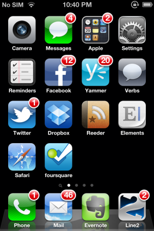
Look at all the tiny iPhone tiles lines up with their little bubble notifiers. There are even folders so you can cram more tiny tiles on your screen! Scrolling is right to left.
Judie: It is also getting a bit long in the tooth, if you ask me. Apple needs to do something to up their game. =P
Dan: The iPhone’s home screen doesn’t actually do much of anything to enhance the user’s experience on the go, either.
Judie: Right –other than allowing numbers to pop up when an app has notifications or displaying notifications with the new pulldown dashboard iOS 5 introduced.
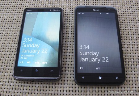
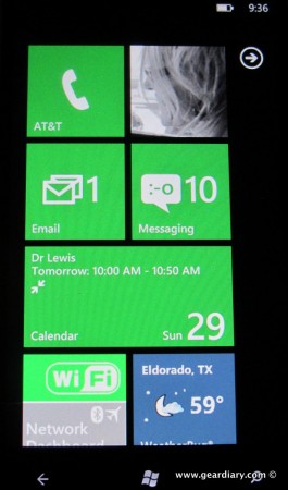
Dan: Windows Phone offers Live Tiles and… I love them. Right there on the home screen is a wealth of information access; better still, the information is constantly being updated, and it is in real time.
Judie: The craziest thing about this is that while the tiles are constantly flipping and updating, it seems to be without any negative impact on battery life!
Dan: I’ve played with a number of different arrangements of the live tiles, and I still haven’t found the one that is “just right”, but I have to admit that after just a few days of use it is hard to go back the iOS’s “dumb tiles”.
Judie: I’ve worked out a system where the top of my home screen is loaded with the tiles I need most: Phone, “Me”, Email, Messaging, Calendar, Network Dashboard and WeatherBug; those show up without any scrolling, and they are constantly updating to tell me if there is something new that I should look at. Next come the less necessary tiles that I still want to be able to see easily: Photos, Internet Explorer, 4th & Mayor (a 4Square app that is better than the official one), the People tile, Calculator, Kik messenger, gReadie (an RSS app), Music & Videos, Yammer, Shazam Encore, Evernote, Lists, a series of individual live tile for assorted family members and friends which update every time one of them posts to Facebook or Twitter, followed by Alarms, eBay, Games, and the New York Times. It’s a bit much, but you should see how quickly I can scroll through that mess. I would really love to add a Lose It! tile to the layout, but so far that app hasn’t shown the Windows Phone OS any love.
Dan: There are, of course, some real shortcomings to the Live Tile system. First, the color schemes that are offered are few in number. You can make the background theme dark or light … and that’s it. In addition, the tiles themselves can have a range of colors, but I’m not all too fond of any of them. Mix in the fact that some apps offer tiles that, when “pinned” to the home screen have a different color than the theme you chose, and you end up with a layout that, from a color perspective, is rather inconsistent. Deal breaker? No. Annoyance? For me, yes.
Judie: I think it’s funny that some of the active tile colors bother you — especially considering the fact that you are colorblind; I find them so engaging! Everything seems so well thought out to me … WeatherBug shows a day or night scene that corresponds with the weather in my location, Pictures rotate through several of my saved favorites, statuses scroll back and forth with the owner’s picture, and on and on it goes.
I love the UI’s little quirks, like how the Messaging tile looks totally freaked out when I’ve got more than a few texts waiting …
Dan: I’m bothered by the size limitations of the tiles. Most “lines” can fit two square tiles. Some tiles however are rectangles and take over an entire row. That’s fine except for the fact that you can’t make a square tile a double-wide rectangle and you can’t make the double-wide tile into a square; that makes no sense. Ideally, Windows Phone needs to let users choose if something is square or rectangular and it would be great if there were a way for end-users to choose to have three different tiles on any one line.
Judie: I do agree that it would be great if there were a way to decide how big you wanted a particular active tile to be; maybe that’s something for a future revision? It’s certainly no deal breaker for me now.
Dan: So do we like the phones and the OS? Yes we do. Our next installment will touch upon the Apps that we are using (and the iOS ones that we miss), the camera and possibly the email app. For now, please keep the questions and comments coming!

love the series. a really fresh look on something different. can’t wait for the next installment.
Totally agree with a couple of things: Android *IS* Windows Mobile for the new generation, and I have definitely found that even with the new OS update there is something lacking on a 3.6″ screen 1st gen WP device. Since you guys are so enamored with the Titan I have made a valiant effort again with my HTC 7 Pro … and can’t do it. You really need a 2nd gen (larger screen) device to take advantage of the OS.
That’s really interesting. Francis has my hd7 now and I’m wondering if he is finding the same thing.
Sent from my Windows Phone
——————————
I’m doing ok with the Hd7 screen. Coming from my 4.52″ SGS2, it’s a bit of a downgrade (both quality and size) but am managing navigation pretty well. The apps are the biggest concern I have, but like any other “new” (which I don’t mind saying) OS the apps will come. WP7 is doing some great things, and hitting a specific market for the “it just works” mobile crowd. Add a touch of class on top with the live tiles and you have a good combo. My main argument still with iOS about the homescreen and capability of personalization. WP7 is not even close to the same as Android on that front, but I find the tile setup very satisfying. It’s true though once you get a taste of a larger screen, there is no way to go back.
I have to agree that the larger screen really makes a difference with WP; I liked the UI on the Lumia 710, but I am truly enjoying it on the Titan. =)
Maybe it’s just me, but Windows Phone homescreen UI seems ugly to me.
Judie’s home screen picture with all green tiles is ugly. No offense Judie! Or I think I’ve seen them all blue. But ugly. Dan’s iPhone screenshot looks much better to me. But yes, the tiles are more useful than the static icons.
Just me?
Agree on Android being the new WinMo tweaking annoyances. Thanks or mentioning that, I hadn’t been able to put my finger on it, but it’s so true!
Fun series, thanks!
Joe, they are magenta today. =P
Judie,
It’s not so much what color it is, but just that there are these big square blocky things that are all the same color except for a couple random ones which happen to be different.
It looks clunky, rather than rounded and smooth. And it doesn’t look unified and pretty.
An overall “theme” for the tiles would be nice, rather than 80% blocky and monotone and 20% being different and random (a picture or weather or whatever).
From what I’ve heard, it’s very functional and nice to use but I don’t know, I just find the Windows Phone UI ugly for some reason. Is that just me?
Joe… I’m with you… And I’m color blind. 🙂
I’ve been thinking that if MS would offer the option of rounding the tile edges, it might make them seem more “friendly”, but I kind of like the tiles as they are. Isn’t it funny how the things that bug some people are a total non-issue for others? And I am sure that there is something that makes me crazy that you guys probably wouldn’t even notice! =P
Judie Stanford
http://www.geardiary.com
Sent from my Windows Phone
——————————
I think if they rounded them, they’d start looking too much like Apple… 🙂 But I do agree that it would be nice if the user to decide which tiles are single width and which are double. I’m guessing that that feature is indeed coming.
Ha! Perhaps … and we know how Apple likes to sue! 😉
Although I can see how the larger screen would come in handy with this OS, I REALLY hate carrying ound the extra size even with my Evo 3D and anything larger than that would annoy me more. I love the physical size of the iPhone, but I know Android users who I’ve spoken to who get used to the larger screen can’t stand going to the smaller iPhone screen, even when the rez is higher than on their Android device – lol! That said, I’ll be curious as to which apps are lacking for you guys. For me its the limitations in language handling (and the lack of certain language support) and missing travel/language apps that make it a no-sale for me at this time more than anything else. When it comes to handling multiple languages Apple – on all their platforms – kills everyone. No one comes close to the smooth way they handle multiple languages and the transitions between them. Rumor has it that Tango will improve immensely on WP languages tho!
Hmmm… Still seems like wait and see and wait for the 3rd generation OS release.. Not quite ready for mainstream play..
Windows phone is the best ,i like me and not change