The NIH estimates that as many as 15 – 20% of Americans have some degree of dyslexia, which can make reading and comprehension difficult. It often results in sufferers transposing or rotating letters or numbers, as well as having difficulty differentiating similar looking letters such as i and j. They might also see the letters and numbers floating and moving as they try to read … which can cause issues with reading speed and comprehension. When I was young kids with these sorts of issues were simply labeled ‘slow’ (or worse), but now the condition can be recognized and diagnosed, and help put in place to allow the child to better handle the situation.
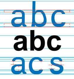
A major effort at helping those with dyslexia better cope with information presented on computers and web sites, the Dyslexie Project looked to create a font more readable for dyslexics.
Here is the quote from the Scientific American site:
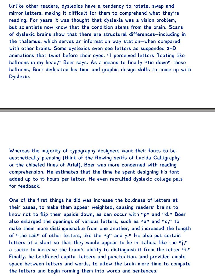
Unlike other readers, dyslexics have a tendency to rotate, swap and mirror letters, making it difficult for them to comprehend what they’re reading. For years it was thought that dyslexia was a vision problem, but scientists now know that the condition stems from the brain. Scans of dyslexic brains show that there are structural differences—including in the thalamus, which serves an information way station—when compared with other brains. Some dyslexics even see letters as suspended 3-D animations that twist before their eyes. “I perceived letters floating like balloons in my head,” Boer says. As a means to finally “tie down” these balloons, Boer dedicated his time and graphic design skills to come up with Dyslexie.
Whereas the majority of typography designers want their fonts to be aesthetically pleasing (think of the flowing serifs of Lucida Calligraphy or the chiseled lines of Arial), Boer was more concerned with reading comprehension. He estimates that the time he spent designing his font added up to 15 hours per letter. He even recruited dyslexic college pals for feedback.
One of the first things he did was increase the boldness of letters at their bases, to make them appear weighted, causing readers’ brains to know not to flip them upside down, as can occur with “p” and “d.” Boer also enlarged the openings of various letters, such as “a” and “c,” to make them more distinguishable from one another, and increased the length of “the tail” of other letters, like the “g” and y.” He also put certain letters at a slant so that they would appear to be in italics, like the “j,” a tactic to increase the brain’s ability to distinguish it from the letter “i.” Finally, he boldfaced capital letters and punctuation, and provided ample space between letters and words, to allow the brain more time to compute the letters and begin forming them into words and sentences.
And here is the exact same thing in the dyslexie font:
The interesting thing is that to someone like myself who doesn’t suffer from dyslexia, all we see is a different font. For someone who does suffer from some degree of dyslexia, I have been told that there is a huge difference in what they see and reading the second one is like giving someone back their corrective lenses.
Here is a really cool video showing the typeface in action:
Source: zdnet


Awesome! Now get that font put onto eReaders and into iOS/Android/WP 7 please!!! Looking at their website, it looks like they are working on an app for iOS, but I can’t tell if it has been released or not or if there is a download or purchase link for the font. My German is non-existent. If there is a link in there, could you post it?